Mirror Broken i inne komiksy – mini-recenzja

Dla tych, którzy nie mieli okazji dostać w swoje dłonie startrekowego zeszytu przygotowanego na Dzień Darmowego Komiksu, przygotowałyśmy opinię na temat tego, co znajduje się w środku. Nie jest to jednak recenzja, niemniej starałyśmy się przybliżyć zawartość i spróbować znaleźć target poszczególnych próbek: Mirror Broken, The Boldly Go, Star Trek/Green Lantern i Waypoint.
Zapraszamy do lektury!
MIRROR BROKEN
Scenarzyści: David Tipton i Scott Tipton
Rysunki i kolorowanie: J.K. Woodward
Typesetting: AndWorld Design
Edycja: Sarah Gaydos i Chris Cerasi
Production design: Neil Uyetake
Wydawca: Ted Adams

O czym:
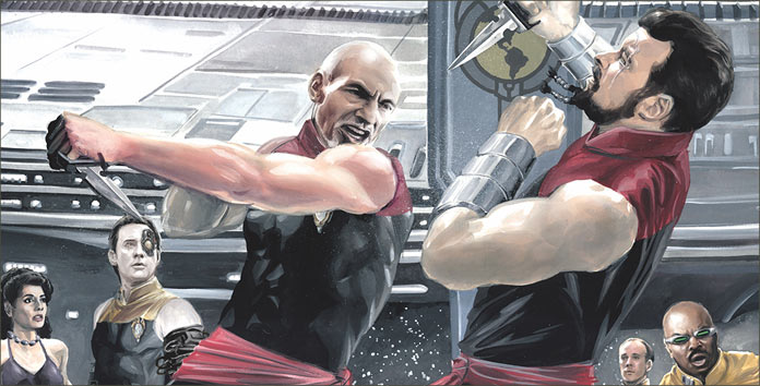
P: Na pierwszy ogień idzie The Mirror Broken – era TNG i do tego Mirror Universe. Muszę przyznać, że uważam Mirror Universe za dobry pomysł tylko w erze TOSa, gdzie pasuje do ogólnego tonu serialu, nie mogę go wziąć więc na poważnie.
M: Dla mnie Mirror Universe nawet nie byłoby złym pomysłem, ot, autorzy zastanowili się, „co by było gdyby” i puścili wodze fantazji. Tyle, że osobiście odczuwam treść komiksu bardziej jako fantazje Barclaya, gdzie cała załoga jest zła, skorumpowana, a on jeden dąży do czegoś więcej, jest bohaterem. Nawet Troi ma seksowniejsze stroje niż w serialu, siedzi w wyzywającej pozie i mam wrażenie, że w swojej enigmatyczności jest dużo bardziej przychylna Barcleyowi niż normalnie.
P To trochę specyfika Mirror Universe – każdy jest zły i każdy dąży do uzyskania większej władzy. Tutaj akurat mamy w tej roli Barclaya, choć to rzeczywiście wygląda wtedy jak jego holodeckowe fantazje. Nie pomaga temu sposób, w jaki komiks jest narysowany.
Kreska:
P: I nie mam tu na myśli samej bardzo realistycznej kreski, ale raczej sposobu w jaki postacie są oświetlone – wygląda to nienaturalnie i trochę surrealistycznie. Przypuszczam, że był to zabieg mający stworzyć atmosferę wrogości i strachu, ale nie jestem do końca pewna, czy był to dobry ruch.
M: Mnie też to nie przekonuje. Pojedyncze strony w normalnej kolorystyce wydają mi się dużo ciekawsze. A skoro już mowa o kresce, wszystkie postacie wyglądają jakby pomiędzy swoimi zmianami porządnie ładowały na siłce. To typowe dla wielu komiksów i w sumie pasuje do założeń MU, ale niektóre postacie wyglądały przy tym dla mnie dość śmiesznie – aż przerysowanie.
P: Jak to, nie podoba ci się napakowany Picard z kozią bródką w stylu złoczyńców z lat 50? I Troi w stroju egzotycznej tancerki?
M: Z jednej strony to właśnie ten wygląd postaci przyciągnął mnie do tego komiksu, ale im dalej w fabułę, tym śmieszniejsze mi się to wydawało. Pewnie jednak gdybym postanowiła przeczytać całość, ostatecznie bym przywykła. Ale na to się nie zapowiada.
Dla kogo?:
M: Muszę jednak przyznać, że zaciekawiła mnie nieobecność Geordiego i Rikera, która – jak wynika z opisu kończącego komiks – jest uzasadniona i została wytłumaczona w dalszych zeszytach.
P: Mi też jakoś nie zależy na przeczytaniu dalszej części komiksu, choć pewnie zrobiłabym to, gdybym znalazła go w jakiejś czytelni. Przyjemnie przeglądało mi się jednak dodatek, w którym twórcy komentowali projekty postaci – ot, drobnostka, a jednak cieszy.
M: To prawda, wszystkie moje wątpliwości co do treści twórcy wyjaśnili w opisie i komentarzach, tak jakby przeczuli, że tych kilka stron niewiele mówi o całości.
P: A skoro już o kilkustronicowych próbkach mowa…
BOLDLY GO
Scenarzyści: Mike Johnson i Ryan Parrot
Rysunki: Tony Shasteen

O czym?:
P: …przechodzimy do następnego komiksu, a mianowicie Boldly Go, dziejącego się w Kelvin Timeline. Tutaj dostaliśmy zaledwie dwie strony, gdzie Kirk wchodzi na mostek Enterprise’a i właściwie nic poza tym. (Nostalgicznie, nic się nie dzieje tak jak w nowych filmach <3)
M: Ponieważ to w zasadzie przybliżenie nowej załogi Enterprise czytelnikom. Ot, kilku członków plotkuje o swoim kapitanie i Spocku, dopóki ten nie wchodzi na mostek. Następnie Kirk wita się z każdym z osobna i… mamy “continued in ST: Boldly Go”.
Kreska:
P: Mnie bardziej niż sam komiks zainteresowała strona wcześniej, gdzie przedstawione są okładki poszczególnych zeszytów “Boldly Go”. Ich kreska jest o wiele bardziej interesująca niż wnętrze. W komiksie dostajemy typowe, “przerysowane ze zdjęć” rysunki, gdzie Kirk nie otwiera ust nawet jak mówi.
M: To prawda, wyglądają dużo ciekawiej niż faktyczna zawartość. Do tego pokazują, co czeka czytelników w dalszych zeszytach: Jaylah z najnowszego filmu “Star Trek: W nieznane”, borg, lasery, bary… Zapewne i tak nie ma to zbytniego związku z treścią faktyczną komiksów, a jedynie przyciągnąć czytelnika, niemniej zapowiada się wiele przygód.
Dla kogo?:
P: Cóż, i w tym przypadku ja raczej na dalszą lekturę się nie skuszę, jednak ci, którym nowe filmy się podobały, mogą w nich znaleźć coś dla siebie.
STAR TREK / GREEN LANTERN
Scenarzysta: Mike Johnson
Rysunki: Angel Hernandez
Kolorowanie: Mark Roberts
Typesetting: AndWorld Design
 O czym?:
M: Następną próbką jest fragment z crossovera Star Treka i Zielonej Latarni. Tak, komiksu z uniwersum DC, co nawet nie jest pierwszym tego typu crossoverem. Znów mamy Kelvin Timeline i wytłumaczenie w skrócie, jak doszło do spotkania tych dwóch światów.
P: Nie, proszę nie. Komiksy o superbohaterach są już wystarczająco skomplikowane ze swoimi dziesięcioleciami historii, nie trzeba jeszcze dorzucać do nich Star Treka. Green Lantern to może nie jest najdziwniejsze, co załoga Enterprise’a spotkała do tej pory, ale to kompletnie ze sobą nie gra.
Kreska:
M: Kreska za to ze wszystkich zebranych wydaje mi się najbardziej komiksowo-komiksowa. Nie ma tu zdjęciowych kadrów, sztucznie utrzymywanego realizmu, ot faktyczny komiks.
P: I nic dziwnego, skoro rysownikiem jest jeden z artystów DC, który zwykle zajmuje się właśnie komiksami o superbohaterach. Kreska jest dużym krokiem naprzód w porównaniu do Boldly Go – postacie mają różne wyrazy twarzy i otwierają usta, kiedy mówią. W mojej opinii, ten crossover trafi bardziej do fanów komiksów o Zielonej Latarni, niż do fanów Star Treka, którzy nie czytają komiksów na co dzień.
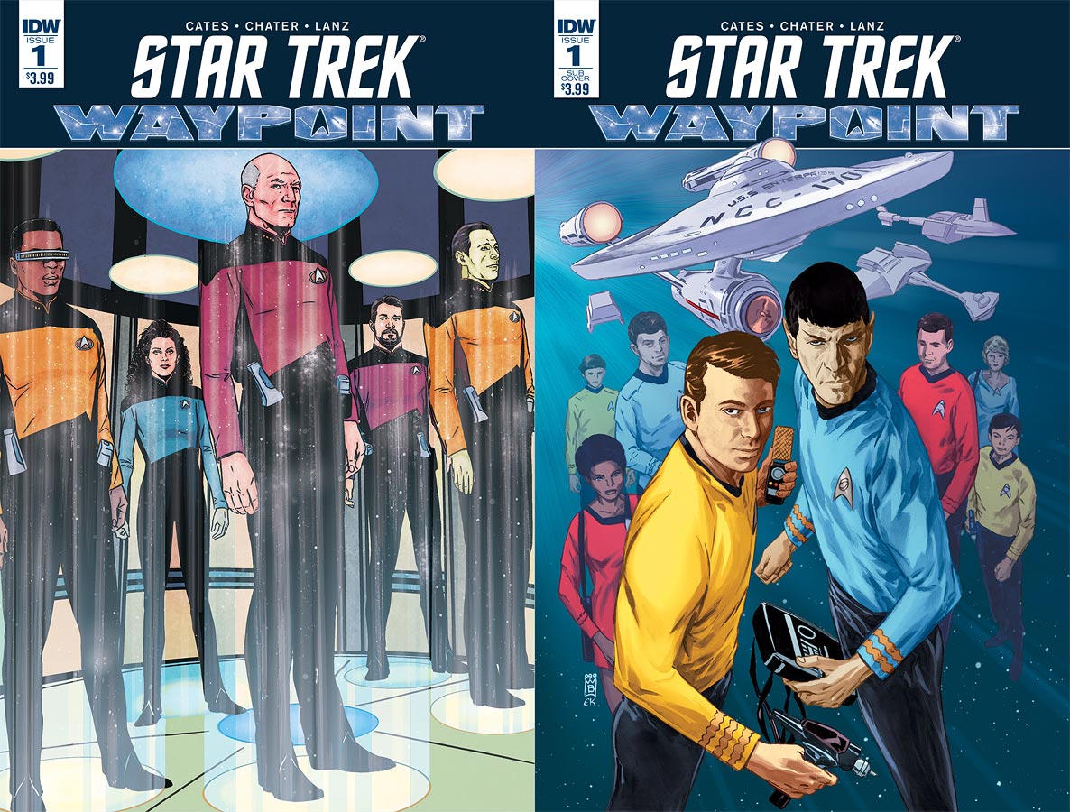
WAYPOINT
Różni scenarzyści i artyści
O czym?:
M: Waypoint jest zaś fragmentem, który najbardziej mnie zaciekawił. Z tego co jednak zrozumiałam, jest to część antologii na pięćdziesięciolecie serialu, ciężko więc stwierdzić, jaka jest reszta komiksów z serii. Ten fragment niemniej zachęcił mnie do sięgnięcia przynajmniej po tę jedną historię.
P: Dla mnie również jest to najbardziej intrygujący fragment. Tajemnicza kostka dryfująca w kosmosie, załoga pełna androidów… Zaczyna się niczym jeden z odcinków serialu.
M: I chyba taki był zamiar twórców: oddać klimat serii telewizyjnej.
Kreska:
P: Jeśli chodzi o kreskę, to jest to chyba moja ulubiona ze wszystkich. Nie jest zbyt realistyczna, ale nie jest też superbohatersko-komiksowa.
M: Ja zaś nie jestem pewna, czy posunęłabym się do stwierdzenia, że jest moją ulubioną, ale z pewnością ma swój urok.
Dla kogo?:
M: Myślę, że ten komiks można polecić każdemu fanowi serialu. To zaś, czy podpasuje, jest już kwestią indywidualną. Z zapowiedzi jednak można wywnioskować, że to krótka, jednoodcinkowa historia, nic wielkiego na “filmową” miarę.
P: Myślę, że Waypoint jest dobrym komiksem dla tych, którzy tęsknią za klimatem serialu i chcieliby przeczytać coś o podobnej konstrukcji.